
The Rundown
The team had 3 weeks to simplify content on an information-heavy government website. The hero page on the original website contains images that are regularly rotated and updated, this caused the alignment on the home page to get skewed and showed no clear information for the interested general public- below is our redesign!
My Role
Researching + Testing + Prototyping for our Team of Three

Educators need to use the NSA website to gain information for their students who are interested in pursuing careers there. The NSA needs these educators because they partner with schools to develop talent in the next generation of employees in their growing careers. These partnerships were very difficult to locate on the website.

These partnerships were very difficult to locate on the website and the information was dug very deeply into the website, in order to make it easier for these busy education professionals to find resources they need, The goal is to design a website that helps Educators and students discover information about partnering with the NSA.
I learned that creating quantitative experiments such as card sorting exercises, A/B testing and conducting website flow tests are all crucial steps towards gaining more in-depth insights for our product launch.
As a part of the re-design, we created an inspiration board to understand what other .gov and even finance websites were doing well to gain understanding about breaking up large amounts of text into quickly readable cards. From the start of the redesign, we laid out a fast guide to set our UI foundation, preferences and stylistic concepts as a team.


Style board explorations played an important role towards guiding our design decisions and helping us convey trustworthiness to the public.
View Heuristic EvaluationWe updated the colors on the original website to be in compliance with the WCAG AAA standards with high contrast ratios. It is imperative for government websites to place accessibility in the forefront of design and development.
 View Usability Slides
Information in the navigation was repeated in sections, for example, there were two ways to get to Students & Educators, but one of the pages took you to a single page with links that took several clicks until getting you to the right page. Through our experiments, the navigation was the main issue we faced when updating this website- card sorting and multiple redlining exercises helped us come to design decisions.

The language used with the tab was confusing during user testing. People did not understood the use of “…” or what "Join our Team" actually meant.
This blue box spans all the tabs, which makes it less clear which tab is open. All sections are placed directly underneath the “About us” section, not what you are looking at.
The selection and hover states for the tabs are not accessible with the light yellow color. Sometimes a yellow box, will show up though.
I took a special focus on the education flow after seeing that it was very underrepresented and that teachers may have a challenging time quickly finding information and forms needed for their students. The unorganized content made it difficult for users and made them feel "lost and annoyed".

During user testing, we discovered that the trouble users were having with the website was with the navigation within the website because it made it difficult to find relevant information users were tasked with finding.
Using a card sorting experiment as a team and then including four outside participants, we organized and re-labeled the information and where it was located. This made information easier to find and provided a more effective experience for users, particularly Educators with little time to waste. Users can now find everything they need without wasting their effort clicking through the website trying to get to their end goals.

Just in case a user makes an error and clicks on partnerships again after the drop-down shows up, or if they want more information about partnerships in general, this page was designed to guide them to all partnerships NSA supports.
 View Usability Testing Plan
After testing several options, we discovered that graphically controlling elements that comprised of a vertically stacked lists of links was our priority on this page's redesign. Our solution was using an accordion component that allowed for one item that could be expanded to view more relevant information to reduce visual overload.

We counted 24 different links visible on this page and no clear explanation of where they may take a user.

Our first iteration broke down the links into buttons instead, we also used color blocking and hierarchy.

After attempting several ideas about how to display all these important links, our solution was an accordion.
Similarly with our problem above, the "Contact us" page had a total of 27 overlong links. We decided to simplify the page by adding an email inquiries drop down list so that people could quickly find the email address they needed. We also added a map of their headquarters to make the page feel more updated and trustworthy.
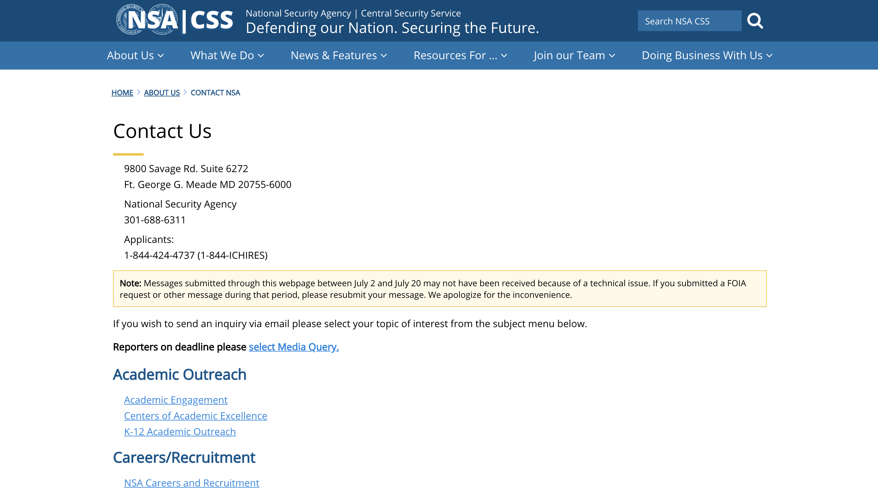

During usability testing, users were unsure how to locate the "contact us"page. Every person tested, tried finding it under "Doing Business with us" or scrolled to the bottom of the page, sometimes resorting to typing into the search bar.
We placed a new "Contact" button on the primary Navigation to ensure that people would find it quickly and easily.
The menu on mobile would have benefited further from conducting guerrilla testing to see if we could have designed it differently and receive more constructive user feedback about it specifically. As a team of three, we made more sense of the Education and Students aspects of the website and app. In just three weeks, we were able to connect closely as a team by creating a culture of learning together.
Side note: Through user testing, we discovered that NSA was very active on Twitter specifically and posted frequently on it. We would have never known based on their current website, so we made sure to highlight the feed on the homepage.